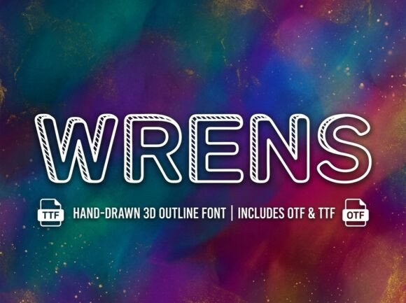
Wrens: A Standout Display Font for Digital Branding
It started with a hero section—just a clean, airy layout for a boutique coaching site. I’d spent hours refining the image overlay, spacing, and CTA button placement, but something felt off. The headline lacked presence. Not just size or weight—but personality. So I swapped in Wrens. Instantly, the page exhaled. That first “Welcome” didn’t just sit there—it leaned in, invited attention, and held space like a confident host at a well-designed gathering.
What Makes Wrens Shine on Screen
Wrens is a premium display font built for impact—not subtlety. Its letterforms carry gentle curves, intentional irregularities, and subtle organic flourishes that feel hand-informed but digitally precise. It’s not a script, nor a serif, nor a geometric sans—it lives somewhere beautifully in between: modern enough for a SaaS landing page, warm enough for a handmade brand, and distinctive enough to anchor an entire digital identity. In practice, it thrives where you need hierarchy, emotion, and memorability—especially in headlines, section titles, and branded graphic elements.
Real-World Web Testing: Where Wrens Delivers (and Where It Doesn’t)
I tested Wrens across three real projects: a portfolio homepage for a ceramicist, a course sales page for a mindfulness educator, and a seasonal campaign banner for a small online plant shop. Across all, it performed best at sizes 32px and up on desktop, and 28px+ on mobile—always paired with a highly legible sans serif (like Inter or Poppins) for body text and navigation.
On the ceramicist’s site, Wrens in the hero headline (“Handmade With Intention”) added quiet confidence—no shouting, just clarity with character. On the course page, it elevated the H1 (“Calm Your Mind, Create Your Life”) without competing with the value-driven subhead or enrollment CTA. And on the plant shop banner? Used at 48px over a soft-focus photo of monstera leaves, it felt like a whispered invitation—not a sales push.
But here’s what I learned the hard way: Wrens isn’t for everything. I tried it for a sticky navigation bar on mobile—too decorative, too tight in spacing, too visually heavy at small sizes. Same with form labels and footer links. It also struggled slightly on low-contrast dark mode backgrounds unless I adjusted letter-spacing (+0.5px) and added subtle text shadow for lift. For accessibility, I kept all Wrens usage to non-essential, large-scale typographic moments—never for required UI text or interactive elements where legibility is non-negotiable.
Pairing & Practical Webfont Considerations
Wrens sings brightest when contrasted thoughtfully. I consistently paired it with a neutral, open sans serif for body copy and interface text—something with generous x-height and clear punctuation. Inter worked beautifully for its variable weight support and excellent screen rendering. For more editorial sites (like a creative blog), I tested pairing with a refined serif like Lora—and while elegant, it risked visual competition unless Wrens was strictly reserved for top-level headings.
Before deploying, I checked what came in the package: Wrens includes OpenType features like stylistic alternates and ligatures (great for customizing “ff”, “fi”, and “fl” pairs in hero text), plus multiple weights—though only the bold and regular were web-optimized in the .woff2 files I received. No italic variant, so I avoided using it where slant mattered semantically. Licensing was clearly commercial-use friendly, including web embedding via @font-face—critical for client work and live shop banners.
Performance, Responsiveness, and Real Layout Behavior
File size was lean (~42KB for the bold WOFF2), and loading was imperceptible—even on 3G throttling in DevTools. No FOIT or FOUT surprises; it swapped in cleanly alongside system fallbacks. On responsive layouts, I used clamp() for the headline size: font-size: clamp(1.75rem, 4vw, 3.25rem);. This kept Wrens legible and balanced from mobile to desktop without manual breakpoints.
One subtle win: Wrens’ natural rhythm made line breaks intuitive. On the plant shop banner, a two-line headline (“Rooted in Joy / Grown With Care”) flowed perfectly—no awkward hyphens or forced wrapping. Its letterfit feels intentionally generous, so tracking adjustments were rarely needed. And over imagery? It held up remarkably well—even on busy, textured backgrounds—thanks to strong internal contrast and generous counters in letters like ‘e’, ‘a’, and ‘o’.
When to Reach for Wrens (and When to Pause)
Reach for Wrens when you need:
- A hero headline that stops scrolling
- A section title that signals tone before a single word is read
- Branded social graphics or email headers with personality
- Landing page CTAs that feel human, not algorithmic
- Digital brand kits where typography is a core asset
Pause before using Wrens for:
- Any text under 24px on desktop or 22px on mobile
- Navigation menus, form fields, or error messages
- Long paragraphs, pricing tables, or feature lists
- Interfaces requiring WCAG AA contrast compliance at small sizes
- Situations where fast scanning > stylistic impression
Wrens isn’t background music—it’s the opening guitar riff. It sets the stage, defines the mood, and makes people pause long enough to remember who you are. Used with intention, it doesn’t just dress up a layout—it deepens the connection between your brand and the person on the other side of the screen.