Kadam: A Bold 3D Display Font for Confident Brand Statements
It was Tuesday afternoon, and I had just opened a fresh brand board for a local ceramic studio—hand-thrown pieces, earthy glazes, quiet confidence. The client wanted something “structured but warm,” “modern without feeling cold.” I scrolled past the usual suspects—clean sans serifs, soft scripts—and landed on Kadam. Not because it was trendy, but because its isometric geometry felt like an honest match for the studio’s process: precise, dimensional, tactile. I typed “Clay & Co.” in all caps, set it at 48pt, and paused. It didn’t just sit there—it occupied space.
A Font That Builds, Not Just Types
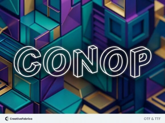
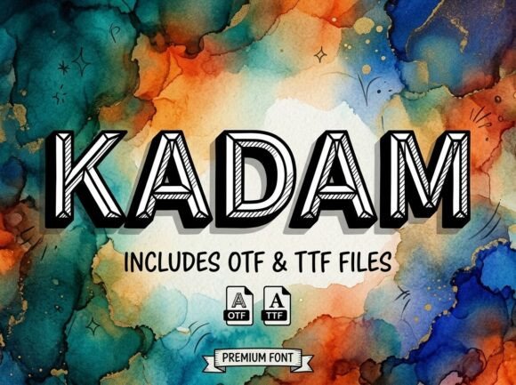
Kadam is a display font with architectural DNA. Its letterforms are bold, blocky, and rendered in rhythmic isometric projection—think drafting table meets digital sculpture. There’s no illusion of depth; instead, Kadam commits fully to its 3D logic, with consistent angles, clean joins, and a subtle visual cadence that makes even short words feel intentional. It’s not playful or nostalgic—it’s grounded, deliberate, quietly assertive. The personality isn’t loud, but it’s unmistakable: structured, contemporary, and spatially aware.
I tested it across real touchpoints: a logo lockup (with a simple lowercase sans serif for the tagline), a matte-finish business card, a website hero banner, Instagram story banners, and a product label for their limited-edition stoneware mugs. In every case, Kadam held its own—not as background texture, but as a structural element. On the mug label, its geometry echoed the rim’s curve and the handle’s angle. On the website header, it created instant hierarchy without shouting. And on the business card? It gave weight to the name without needing extra graphic elements.
Where Kadam Shines (and Where It Steps Back)
Kadam thrives where impact matters more than endurance: logos, signage, packaging headers, social media covers, posters, and editorial headlines. Its strength lies in brevity—single words, acronyms, shop names, event titles. At 24pt and above, it reads cleanly on screen and print. At 16pt on a mobile screen? Legibility starts to soften, especially in condensed contexts like captions or navigation bars. It’s not built for body text, footnotes, or long-form web copy—and that’s by design. As a display font, it earns its place through contrast and intention, not versatility.
That said, I wouldn’t reach for Kadam for a law firm’s letterhead, a healthcare app interface, or a children’s book series. Its tone is too composed, too dimensional for those needs. And while it works beautifully in bilingual contexts with Latin-based languages (it includes full diacritic support), it doesn’t extend to Cyrillic, Arabic, or CJK—so keep that in mind if your project spans broader language sets.
Real Pairing Notes—No Theory, Just What Worked
I paired Kadam with three typefaces during the ceramic studio project, each serving a different purpose:
- A neutral sans serif (like Inter or Manrope) for body text and supporting copy—its clean lines let Kadam breathe while keeping readability high.
- A warm, low-contrast serif (think Literata or PT Serif) for quotes and studio philosophy statements—created a grounded, human counterpoint to Kadam’s geometry.
- A restrained handwritten font (used sparingly, only in signature strokes on packaging)—added craft-level warmth without competing. Never tried pairing it with another display font; the visual density clashed instantly.
The key wasn’t balance—it was dialogue. Kadam doesn’t need “softening.” It needs context that acknowledges its presence without apologizing for it.
Practical Testing Tips Before You Commit
Before locking in Kadam for client work, test these four things:
- Print it at actual size—especially on the paper stock you’ll use. That matte uncoated stock muted some of Kadam’s sharpness, so we bumped tracking by 20 units for the final label.
- Check it in UI mockups—not just static images, but live previews in Figma or Adobe XD. See how it behaves with hover states, responsive breakpoints, and loading delays.
- Run it through accessibility contrast checkers—its heavy weight and tight spacing can dip below WCAG AA thresholds at smaller sizes or on light backgrounds.
- Verify licensing—Kadam is a commercial font, and its license covers desktop, web, and app use, but not resale in templates or merchandise unless extended. Always double-check before handing files to a printer or developer.
Also worth noting: Kadam ships with one weight (Bold) and standard OpenType features—no ligatures, swashes, or stylistic alternates. That’s not a limitation; it’s clarity. This isn’t a font meant for expressive variation—it’s meant for confident, singular statement.
Final Real-World Takeaway
Kadam won’t solve every branding challenge—but when your project has dimension, intention, and a quiet sense of craft, it adds a layer of authenticity that’s hard to fake. It’s not decorative. It’s declarative. I’ve used it for a handmade tile workshop’s storefront sign (looked incredible lit at dusk), a creative studio’s pitch deck title slides (instant gravitas), and a small-batch candle line’s limited-edition box (the isometric angles mirrored the embossed lid pattern). In each case, it didn’t distract—it anchored.
If you’re weighing Kadam against other display fonts, ask yourself: Does this need rhythm, structure, and spatial awareness—or does it need warmth, motion, or tradition? Kadam answers the first question with precision. It’s a premium font for designers who treat typography like architecture: not just arranging letters, but building meaning, one measured angle at a time.